I'm know my colleagues are sick of me gushing about it by now.
But it's just so.....smooth. I can't help it. The Mercedes-Benz USA web site. I've been in love with it for about 6 months now. The site is built like their vehicles: functional, luxurious, innovative, solid, and prestigious. Whatever you come to the site for, they've got it. Lets look further at two of the aspects that make M-Bs brand personality convey to the customer.
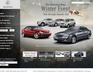
Functionality:  The #1 thing I love about Mercedes' site is, every constituent gets equal billing on the front page. (left)Mercedes clearly understands the purpose of their site goes far beyond just selling you a car. They know they have to make you want to buy first. Promotions, Featured Product Lines (ex. SUVs), New Vehicles, and "Only in a Mercedes"(their "Why Mercedes?" microsite), all permanently reside in 'boxes' on the front page, yet you can always go shop at any time. No matter that you are looking at their history museum in Munich, the 'Build Your Own', Locate a Dealer, or 'See All Vehicles' links are plainly visible in the top right corner of every single page. This is especially remarkable considering, with 120 years in the business, Mercedes doesn't exactly have a pressing need to tell you "Why Mercedes?" or who they are, (unlike Chery.... wink wink)
Usage of Iconography:
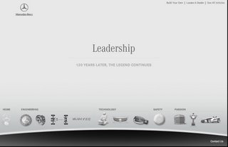
Specifically when you go into the 'Leadership' microsite, I love how M-B makes such smart usage of icons to explain why they feel you should buy one of their vehicles.
The javascript rollovers take you to either an airbag, brake drum, keyless entry fob, or classic car grill to represent their corporate brand pillars: Engineering, Technology, Safety, and Passion. For instance if you select the classic Mercedes grill(Passion) icon, you can learn about their awards(trophy icon), history in auto racingformula racer icon), museum in Munich, classic car HQ in California, et al. Like a good movie, I think the companies that are good at this site strategy thing really take you to another place in the 'web experience' and steep you in their culture. You don't just read about the company you "feel" them, which is the whole point.
More Kristalogy In:

4 Responses to Web Branding Site Critique: Mercedes-Benz
I'm on the MBUSA site all of the time. And yes, it is an excellent design with lots of functionality. But, it does have a few loading issues - it can be terribly slow.
Also, MBUSA has a great marketing campaign called "Mixed Tapes." They release a CD's worth of free MP3s. Every try to get on their site during the first few days of this promo? You can't even download one song let alone the full CD. For those interested, you can find the links/posts on my blogs - search for mixed tapes and read the post for details.
Nice blog BTW. I look forward to coming back often and reading more. Thanks for the post.
- Greg http://www.eoecho.com/allthingsmercedes
Greg: Thanks for visiting and for your comments. I saw the 'Mixed Tapes'...thought it was very British-sounding, as opposed to the common term 'mixtape.' They should feed them to iTunes in a podcast huh?
Lovely post and we should duly take some notes about it. If mercedes is on the high-end side of cars and we are on the high-end side of PCs... it's only natural to see great things they've done and we should do...
Estaban: I agree. It's about expanding the definition of the website. What is it really for? Sales only? No. I think if you are eBay or Overstocks.com that can be said, but not for a corporation....especially a new one :-) --K
Add Comment